Public awareness about ethics in technology has heightened over the past few months. A greater level of scrutiny is being applied to the relationships between technology and user agency. Although much of the conversations have centered on privacy and data, ethics in design is also an important piece of the conversation. After all, design determines how a user interacts with the interfaces around them.
Sneaky practices in design are nothing new, and chances are they’ve annoyed you more times than you can remember. They’re referred to as dark patterns. A dark pattern is a user interface that’s designed to trick users into doing things they wouldn’t typically choose to do. Dark patterns take the same heuristics that define good design and invert them, essentially using what we know about user behavior and psychology to take advantage of users.
Using persuasion in design isn’t necessarily bad; in fact, it’s present in a lot of successful and perfectly acceptable design. Dark patterns go astray because they deliberately use persuasion to be misleading and sneaky for a short-term goal. The disconnect between dark patterns and good UX is that user experience design is about valuing users, rather than simply using them as a means to an end.
You’re probably familiar with a handful of known dark patterns. They’re so ubiquitous that UX Designer Harry Brignull even started a website to give them nicknames and call them out. A few examples are below, along with some notes on improvement so that they can be more neutral than sly.
Dark Pattern #1: Confirmshaming
Confirmshaming uses guilt to persuade a user to opt into an offer. The wording is crafted to make the user feel negative about declining.
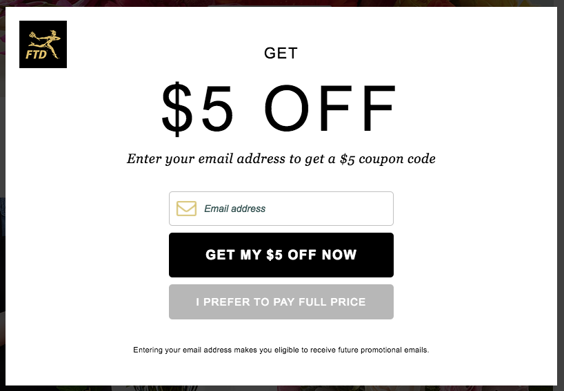
In the example above, this pop-up gates the rest of the website, preventing the user from accessing any of it unless they click one of the buttons. Pop-ups are already a chore to move through, so forcing the user to share contact information or admit to condescending commentary only adds to the friction.
Here’s a better example:
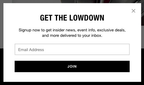
A lack of editorial commentary and an easily recognizable way to close this pop-up is far more neutral. (via Skullcandy)
Dark Pattern #2: Forced Continuity
User experience is especially touchy when it comes to people’s money. Forced continuity is the pattern of having a user sign up for a free trial and enrolling them into a paying scheme without their knowledge.
This tactic is commonly used in freemium business models to convert users into paying customers. It’s tied to marketing practices and business goals, so it’s not a purely design-oriented decision. However, if you are going to have an automatic conversion for someone on a free trial to become a paid subscriber, there are ways to lessen the shock and practice this with transparency.
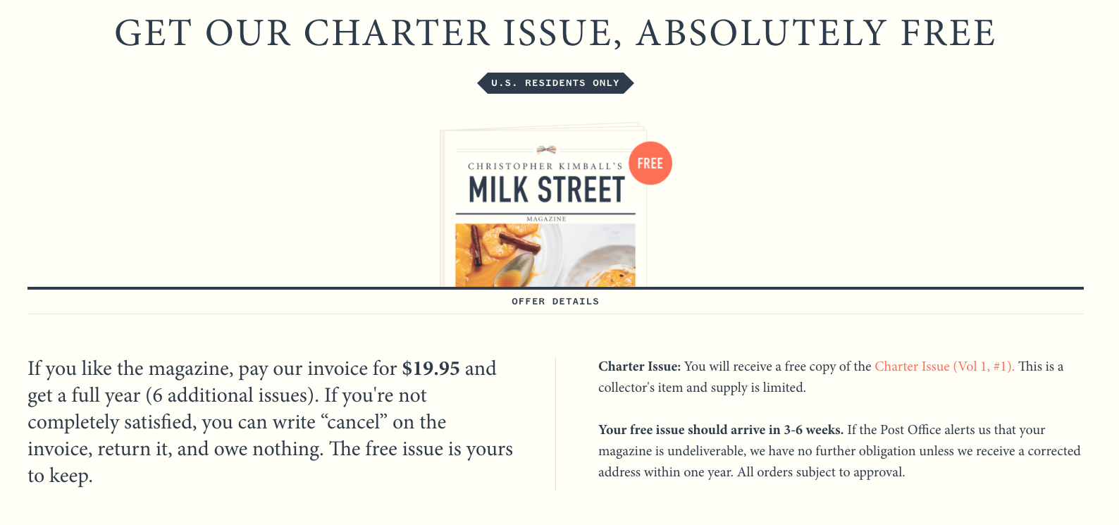
Milk Street magazine navigates this tricky issue well. While they offer a free issue that turns into a subscription, they tell you upfront how to opt out of it. They’ll send you an invoice, but before they do, they’ll tell you how to maintain the free offer only. It’s even in large lettering to prove that they aren’t hiding anything.
An additional option is to send your users a reminder when their trial is almost over with a way to cancel. Users are of course more likely to trust you and associate your company positively when they’re certain you’re not acting liberally with their wallets.
Dark Pattern #3: Hidden Costs
A user spends time and energy putting together an online order, only to see that the total cost has jumped at the very last step. Fees for service, delivery, booking, and more are tacked onto one’s order after the user has understood a certain price point to expect. By revealing costs at exactly the last step of an order checkout, the bet is that the user has invested too much energy and time to back out. The vendor may have a monopoly on the product or service in the order, thereby making the hidden fees mandatory. Users can already feel fraught when spending money online, so tacking on an additional expense this way only increases a tense experience.
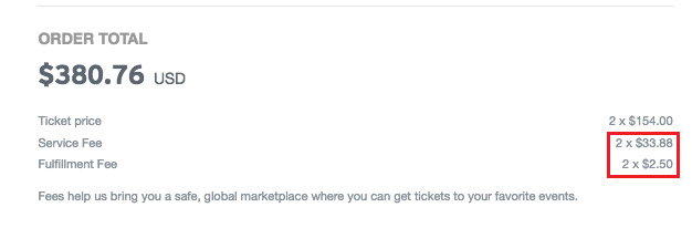
The total of this order jumped nearly 25% at the last step.
Given that hidden fees are often built into vendors that have a monopoly on the product or service, one can argue that it’s better to be upfront about taxes and fees when showing prices. In fact, this is what airlines often do. All fees are factored into the price shown to a user who is fare shopping. Once this user gets to checkout, the breakdown shows that the ticket price in and of itself is lower than shown, but after taxes, fees, and surcharges, the total comes out to the initial number presented. There’s more transparency about the final dollar amount a user will have to pay.
Dark Pattern #4: Disguised Ads
Ever click on a link that you thought would do something specific, only to have a pop-up take over your monitor?
That’s a disguised ad. These are commonly found on websites that rely heavily on display advertising. Since the average click rates for display ads is a very low 0.05%, some advertisers have opted to disguise ads as something else entirely. Here’s an example below for a page that’s offering a free download:
There are a handful of calls to action that instruct a user to click and download, but the actual method to do so is this faint, unimportant looking box of tiny text:
All the other calls to action are disguised ads, taking you away from the purported content and service.
Why are dark patterns so common?
We see so many dark patterns in design because they work…kind of. They’re effective at creating short-term positive results if you’re looking purely at metrics. However, these practices are harmful to a company in the long-term as they chafe away at its reputation.
Dark patterns turn away from the benefits and ethics of treating users well. One of the fundamental traits of experience design is empathy and validating one’s audiences. So even if there isn’t a clear solution for all, keeping users centered in our design decisions can move all designs closer to a standard of honesty, transparency, and long-term success.