A few weeks ago I attended the Awwwards Conference in San Francisco, an event where digital designers come together to share their knowledge and experiences. I left the conference with a sense that those of us in this industry aren’t all that spread out across a spectrum of levels, only perspectives.
I heard from people who have been in the industry for 20 years and a painter who was designing a site for the first time.
I spoke to someone in sales who was taking two full days to learn what goes into a successful digital product.
I heard from a brand designer and illustrator who designed a house with his graphic design tools.
I heard from the closing speaker who had turned a bowling alley into an immersive art installation with George R.R. Martin.
This is never the range I expected to see while I was at a digital design conference in the Bay area. Once I heard the depths designers took their skills to, it was clear to me that anyone at any level in the tech industry could harness the power to produce something meaningful. We all have a fundamental understanding of the creative process and how to make that process enrich any aspect of our projects and our lives.
To be clear, the brand designer who designed his house in Illustrator still hired an architect to bring his ideas to life, and the person in sales is not going to go oversee product design. The key here is that all people in this industry can combine their unique perspectives with a common understanding of process to be able to solve a wider range of problems than we often think is possible.
Funny enough, throughout the conference I was getting frustrated with how many talks were about core design processes and teamwork pillars. When there are so many talks about “design thinking” or “how to use empathy in design,” I have a difficult time seeing the value in listening to another talk about topics I’ve heard.
Turns out, I hadn’t listened to enough talks about empathy, because that is exactly what I was failing to grasp. As I thought about what I learned from the conference in the days following, I realized that the backbone of a successful product is understanding.
A few memorable talks
Claudio Guglieri: Making technology more natural
Microsoft
This was the talk we all needed. As the environments and scenarios we build for get more and more expansive, we need to figure out better ways to close the gap between the real and virtual world.
Claudio went over ways his team observed natural environments to pick up on patterns and reliances that would enhance user comfort level if brought into technology. He touched on elements like lighting, depth perception, and material.
What I found most compelling was the way their team determined sound notifications. Sound indicators often get overlooked as a crucial part of digital experiences, but they have so much impact on our relationship with technology. For instance, how often do we pay attention to the way our phones vibrate?
To determine sound notifications for Microsoft platforms, the team chose some phrases that represented type of alerts they were building, such as “New Message.” They asked people to speak the phrase in all different languages and recorded them to pick up on voice inflections and patterns. They layered all the recordings for each phrase and used the abstraction to pinpoint the common parts of the phrase where people raised their voices. Notifications then received sounds that most closely repeated the abstraction.
Watch Claudio’s Ted talk here.
Jenny Gove: Transforming web user experience
Progressive web apps (PWAs) are a way to create mobile web browsing experiences that feel more like native apps. Jenny talked about some common misconceptions on browser vs app usage on web, explaining ways to really look at mobile usage data.

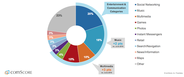
Statistically, people spend much more time on native apps than browsers on their phones. This often translates to companies creating native apps for their products and services, thinking people prefer them. She said that the reason native apps show more use is because people spend much more time on social media, games, and messaging than they spend on daily searches and their online shopping.
Jenny discussed how we can use PWAs for eCommerce experiences in particular. She touched on how PWAs can be used to create quicker entrances for frequent shopping experiences without having to download an app or search in the browser. She demonstrated how Starbucks catered their website to mobile users for quicker ordering from their phones.
At Google, they have a value acronym they live by when designing new features and products. That acronym is FIRE: Fast, Integrated, Reliable, and Engaging. She showed us how the Starbucks website demonstrated these four values in their mobile site.
Watch one of Jenny’s talks about PWAs here.
Val Head: Designing a new reality: Chatbots, VR & beyond
Adobe
I’ve had the pleasure of seeing Val speak a few times, and we’ve even had her in our office to demo Adobe XD with her team. Val is always a joy to hear from, as she speaks with the utmost love for what she does.
In her talk at Awwwards San Francisco, she went into four newer technologies that we’ll be designing for more often: chatbots, voice controlled devices, augmented reality, and virtual reality. She shared a lot of first-hand, relatable experiences that helped us understand the scenarios in which these four technologies should and should not be used for.
She mentioned that when using her Alexa device, it’s quicker for her to set a timer than it is to purchase something (even though Alexa does a good job at recognizing short instructions of what to buy). She pointed out that some tasks require a lot of explaining, and are still faster to do on a computer or phone. We occasionally tend to generalize methods of simplification (in this instance, speaking instead of typing), when the majority of methods are only quicker for some use cases. It was a reminder to talk to a wider pool of users before designing.
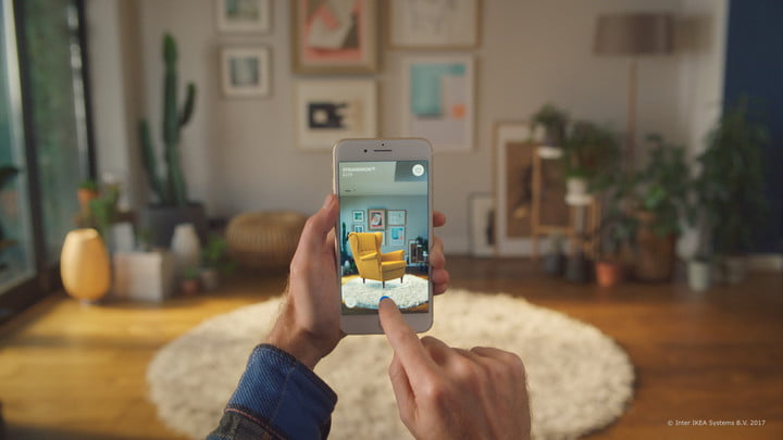
She also talked about how Ikea is using augmented reality to provide a really helpful layer to their eCommerce experience. You can now hold your phone camera up to the location you would want to put an item from their store, and see how the item would look in the space.

She went over what Ikea did to make item placement in this augmented reality feel more real. They have effects like shadows of the object, dropping animation that really sell the item as having weight, and even sizing based on distance. While the experience in itself is already a huge benefit to shoppers, there are many ways to take the experience further by understanding how to design for 3D space.
Listen to a podcast with Val on the topic of designing for new realities.
A few reminders I took with me:
- Always look for ways to make interactions feel more like natural
- Be confident in your ability to problem-solve through process
- Ask for team brainstorming and discussion meetings as often as possible
- Trust your gut, and always try to get work you will love to do
- Talk to people informally as often as you possibly can, rather than in a clinical testing environment
- Take data at face value and rely more on conversations
- Be extremely adaptable to new tools and technologies
- Every design solution is a hypothesis that needs testing
