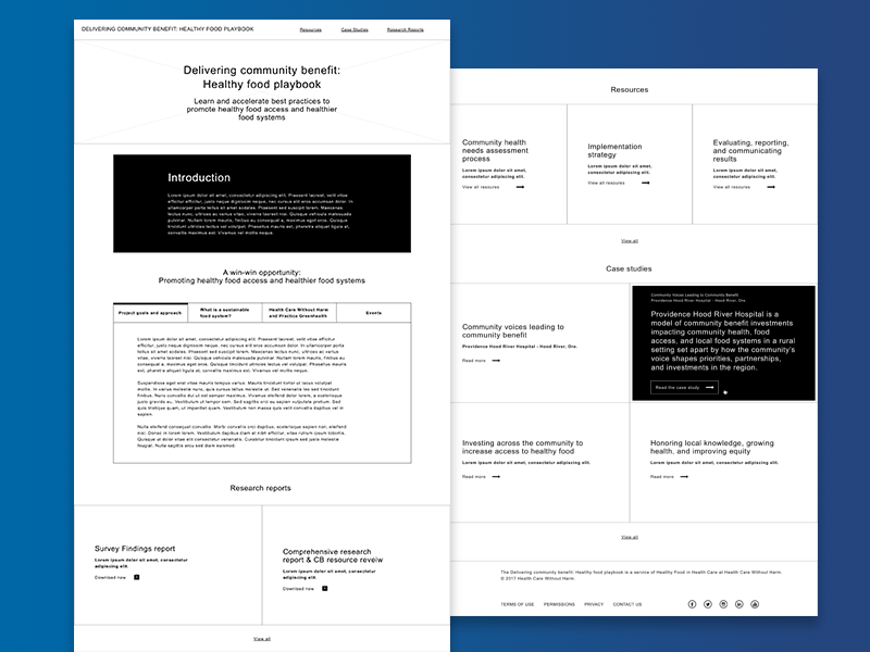
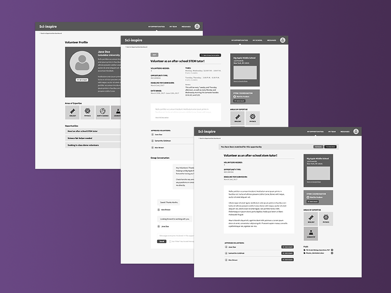
Producing wireframes is a major part of the UX and UI workflow. Wireframes are used to communicate ideas about screen layouts, similar to how blueprints are used in architecture. Wireframing could mean drawing sketches on paper, creating digital, interactive prototypes that mimic the end product, or something in between these two. The amount of information reflected depends on the stage of the product life cycle.
Every team and workflow has its nuances when it comes to the wireframing process, but there are typically three sorts of wireframes in production:
- Low-fidelity
- Mid-fidelity
- High-fidelity
Low-Fidelity Wireframes: Focus on User Flow
Low-fidelity wireframes are the first stage of wireframing. A UX designer arranges these using UX best practices after conducting user research and assessing stakeholder priorities.
Their purpose is to define a page’s hierarchy and structure through the arrangement of basic shapes that represent different parts of a layout. Some of these include the menu, text blocks, and images. Stylistic details such as color and exact copy are omitted; the goal here is simply to nail down page structure and strategy. Discussions about visual appearance will come later in the process, but for now, the focus is to determine and focus on stakeholder goals, user interactions, and user needs.
These black and white diagrams are used to get all parties in agreement to advance the design process. Because they’re rough sketches, they’re very easy and quick to adjust. Common tools to create these wireframes include Sketch, Balsamiq, and a good old pen and paper.
Mid-Fidelity Wireframes: Focus on Functionality
Mid-fidelity wireframes build upon low-fidelity ones by adding refinement and details. They are also usually black and white. Since the purpose of the low-fidelity wireframes is to determine the content and structure, the next step is to start defining UI elements on sections and to determine functionality.
A designer may also introduce proper spacing here if it wasn’t included before. Exact styling still isn’t much of a consideration, and one can create these digitally or on paper.

High-Fidelity Wireframes: Focus on Usability and Design
As you may have guessed, high-fidelity wireframes build upon the details of the mid-fidelity schematics. Here you can add in copy, UI elements, hover states, and text hierarchy. Their purpose is to to make sure that everything going into the design is represented.
High-fidelity wireframes should closely represent the final product, so they should be produced digitally. You can even upload them to a prototyping tool such as InVision and insert hot spots to mimic interactivity.

Mockups
Once all previous wireframes are approved, the designer moves on to UI mockups. This is the most comprehensive stage of design; mockups contain color, typography, images, and even animations. Mockups should present the truest representation of the final product.
Which is the best approach?
Not every type of wireframe is necessary, nor realistic, for every product. If a single stage of wireframes is enough to get vetted by stakeholders, others may not be necessary. Every stage requires questions, edits, and improvements.
No matter where you are in the process, you can and should test
Wireframes of any level can and should be tested. Since they’re iterative, a designer can continue to change parts of a design to better fulfill user needs and project goals. Keep in mind that since wireframes are made cumulatively, lower fidelity ones are quickest and most affordable to change and re-test.
No matter the stage, a little inquiry goes a long way when it comes to getting early feedback for a product. Whether you’re showing cut-out paper prototypes to a tester or having them click through an interactive project, getting a baseline understanding of user successes and frustrations is invaluable information. As the Nielsen Norman Group states, “Your design will be tested, whether your plan for it or not. Once your system goes live and people begin to use it, they are testing it."
